start a project

close
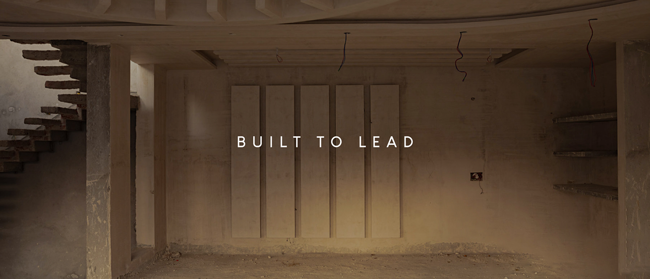
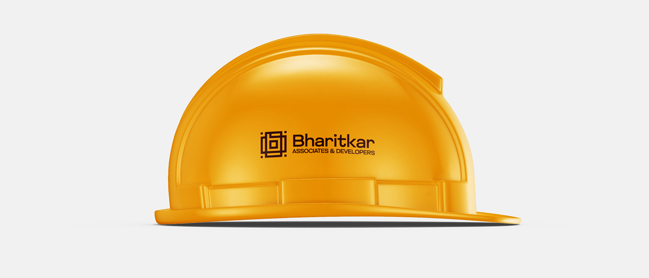
Bhartikar Associates & Developers is a construction company that builds across scales roads, bridges, residential, commercial, and industrial projects. With a strong foothold in government contracts and infrastructure development, the brand needed an identity that captured both its structural expertise and its architectural precision.
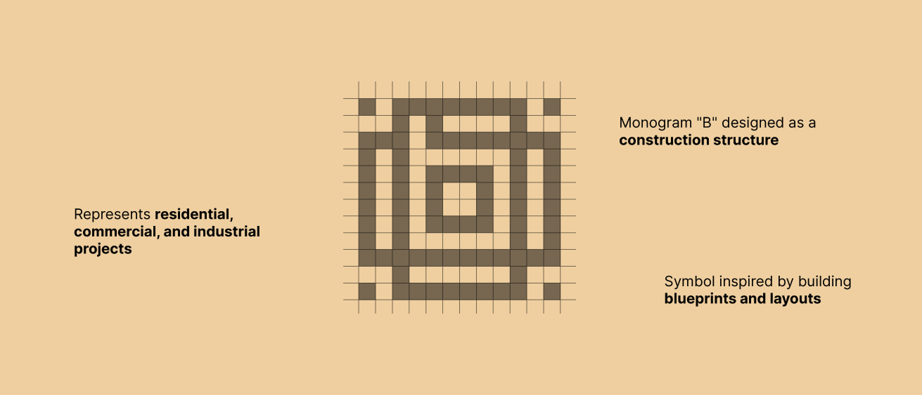


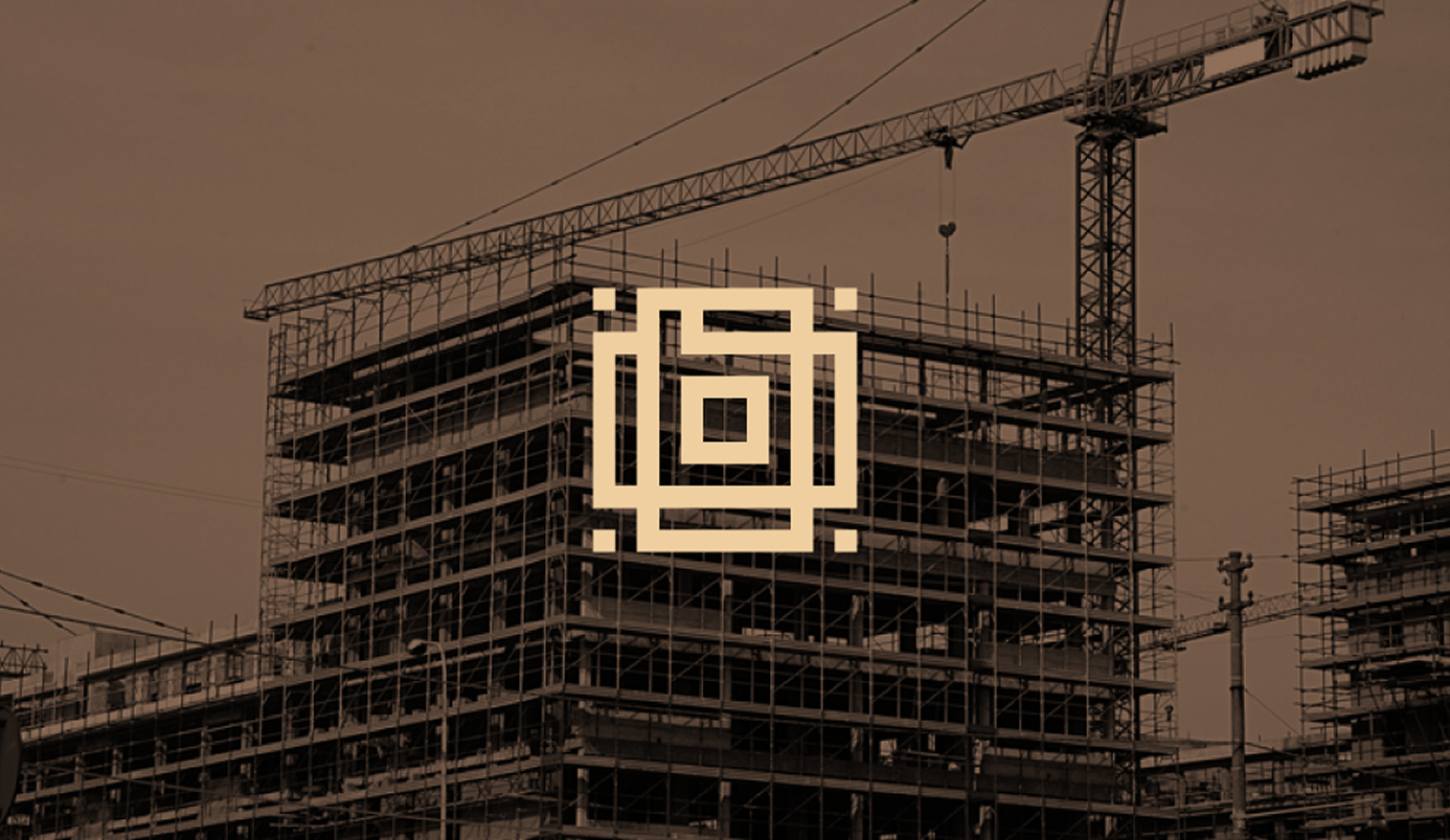
Inspired by blueprints and layouts, the design draws from the visual language of construction itself; blocks, grids, and interconnecting lines.
At first glance, the mark resembles a geometric block. But a closer look reveals the subtle emergence of the letter ‘b’ at its center. This duality, the functional structure and the hidden identity captures the essence of Bhartikar’s work: building forms that hold deeper meaning.
The ‘b’ monogram was designed as a structural form in itself, evoking the rhythm of beams, layouts, and architectural detailing. It speaks to both the engineering precision of infrastructure projects and the design intricacy of residential or commercial spaces.
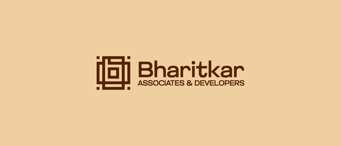
The use of earthy brown and beige tones anchors the identity in stability, reliability and qualities that define construction at scale.


For Bhartikar, the logo is a reflection of how the company thinks about projects: starting from the smallest detail, scaling to a larger whole. From roads that connect cities to blocks that shape homes, the brand identity communicating its versatility with clarity.
The Bhartikar project reaffirms the belief that construction branding works best when it mirrors the discipline of the craft. Blueprints and structures aren’t just functional, they can inspire identity. And when design translates that, a company’s values become visible at first glance.