
start a project

close
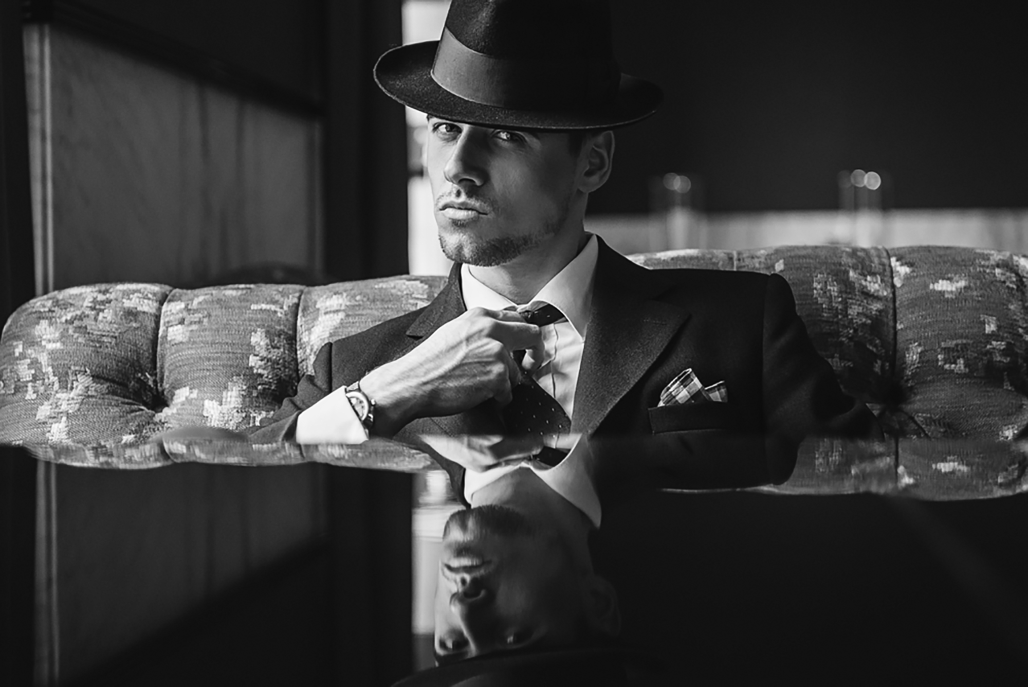
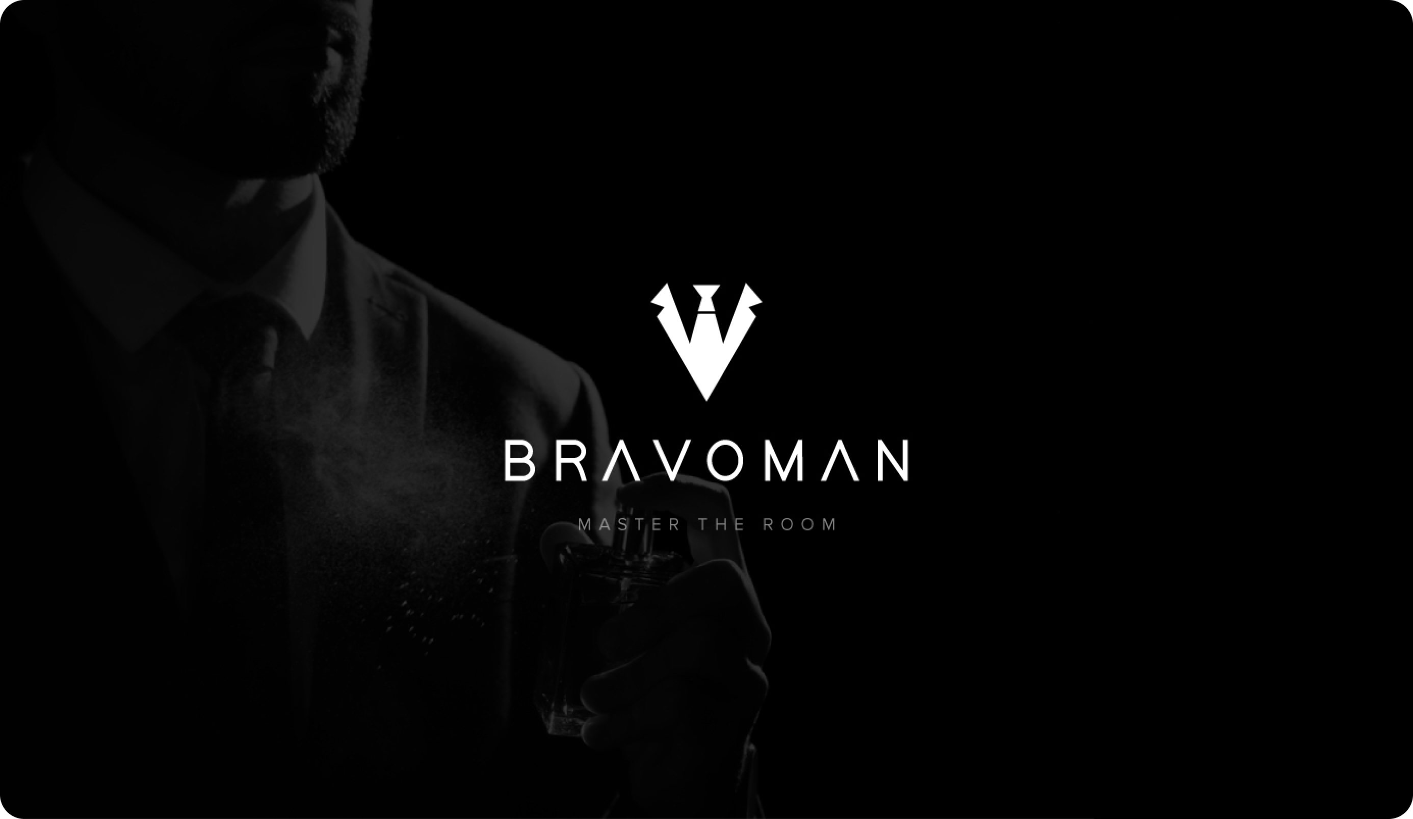
BravoMan is a premium lifestyle brand built for men who aspire to live authentically, confidently, and with style. In a crowded grooming and lifestyle market, BravoMan’s ambition is to not only compete but to elevate itself into the luxury space, offering a brand experience that is both refined and aspirational.
BravoMan’s existing identity lacked the sophistication and elegance expected from a premium brand. To compete with established players, the brand needed a visual identity system that instantly communicates exclusivity, authenticity, and confidence while maintaining versatility across touchpoints from packaging to digital campaigns.
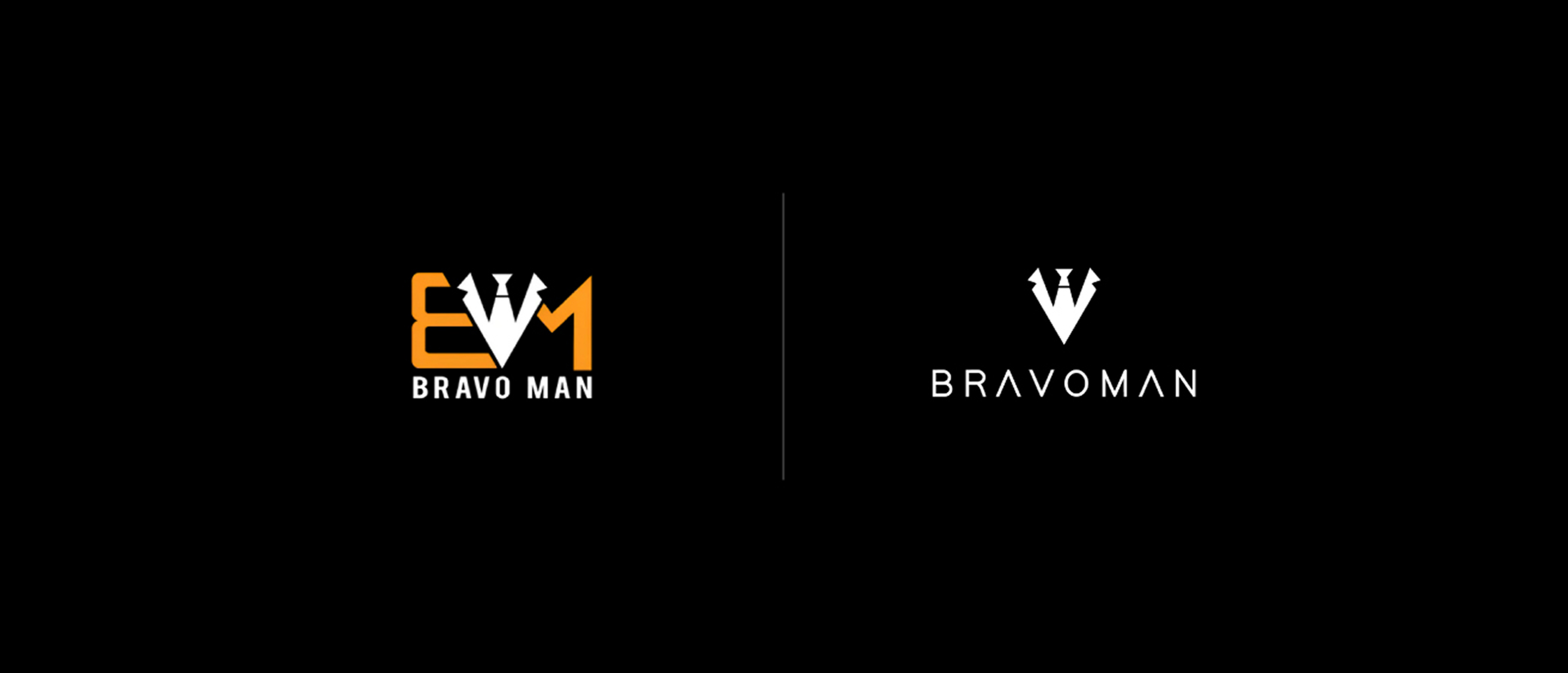
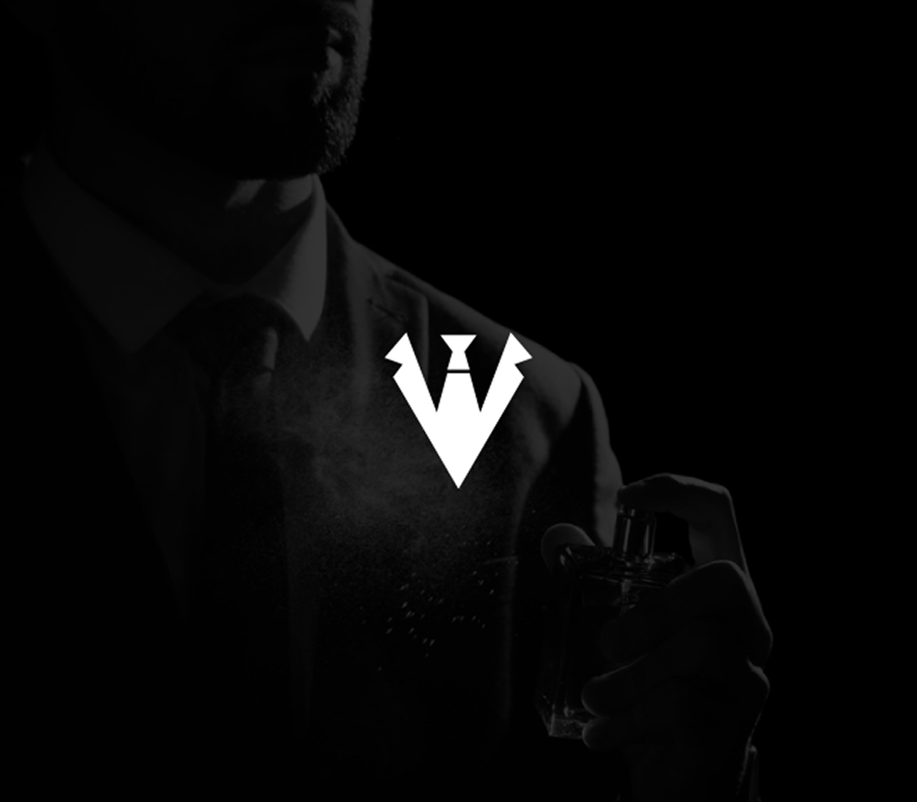
The new BravoMan identity moves towards a minimalist yet powerful logo system that reflects elegance and authority. By embracing a monogram-inspired direction, the design introduces an emblem that balances sharp geometry with subtle curves, symbolising both strength and sophistication. The logo is detailed with fine, understated elements that create depth without compromising clarity, elevating the sense of exclusivity.
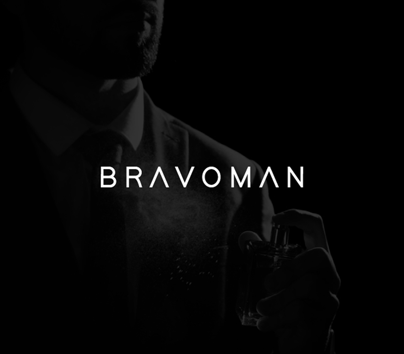
Typography plays a crucial role in this refinement, crafted with clean, modern lines and timeless proportions, the type system is versatile enough to work across digital and print platforms while maintaining a premium feel. Together, these design choices establish a cohesive identity that communicates BravoMan’s position as a luxury lifestyle brand.
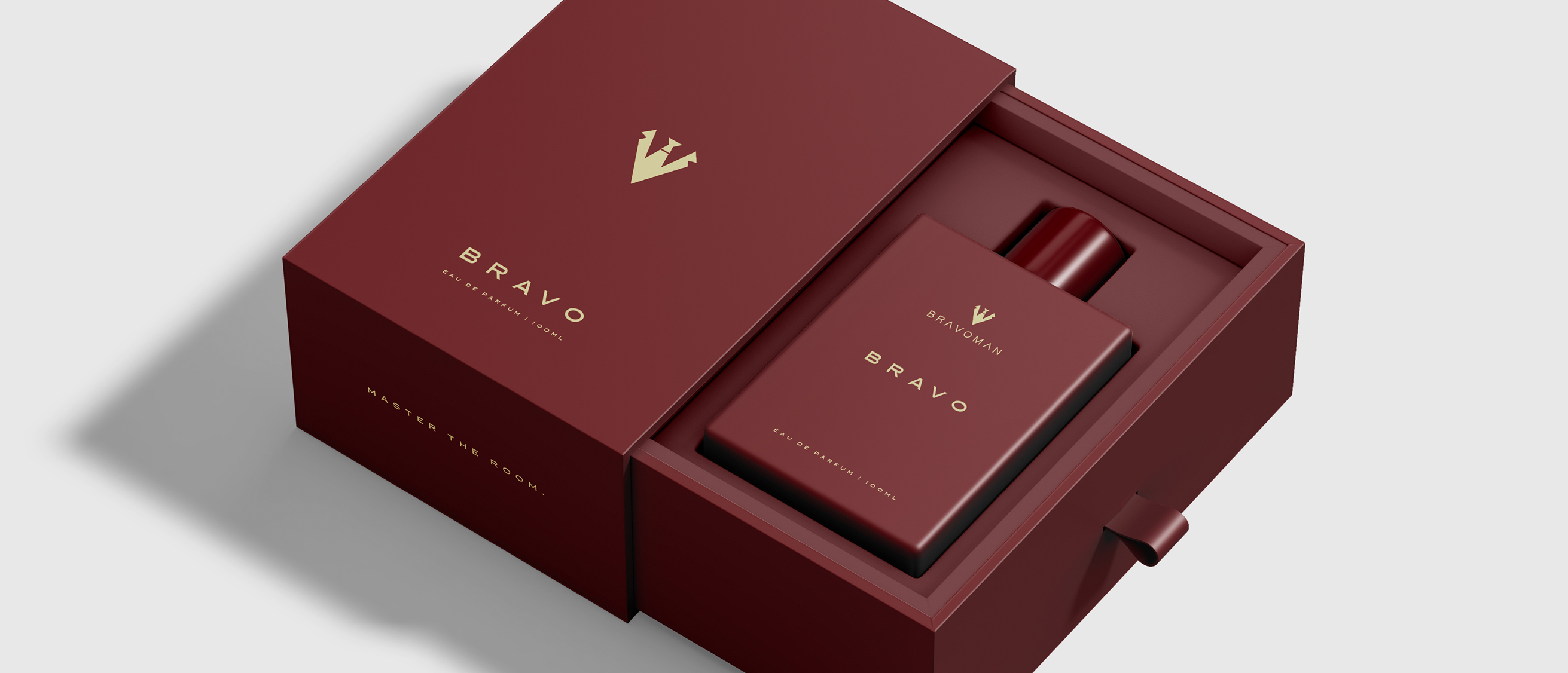
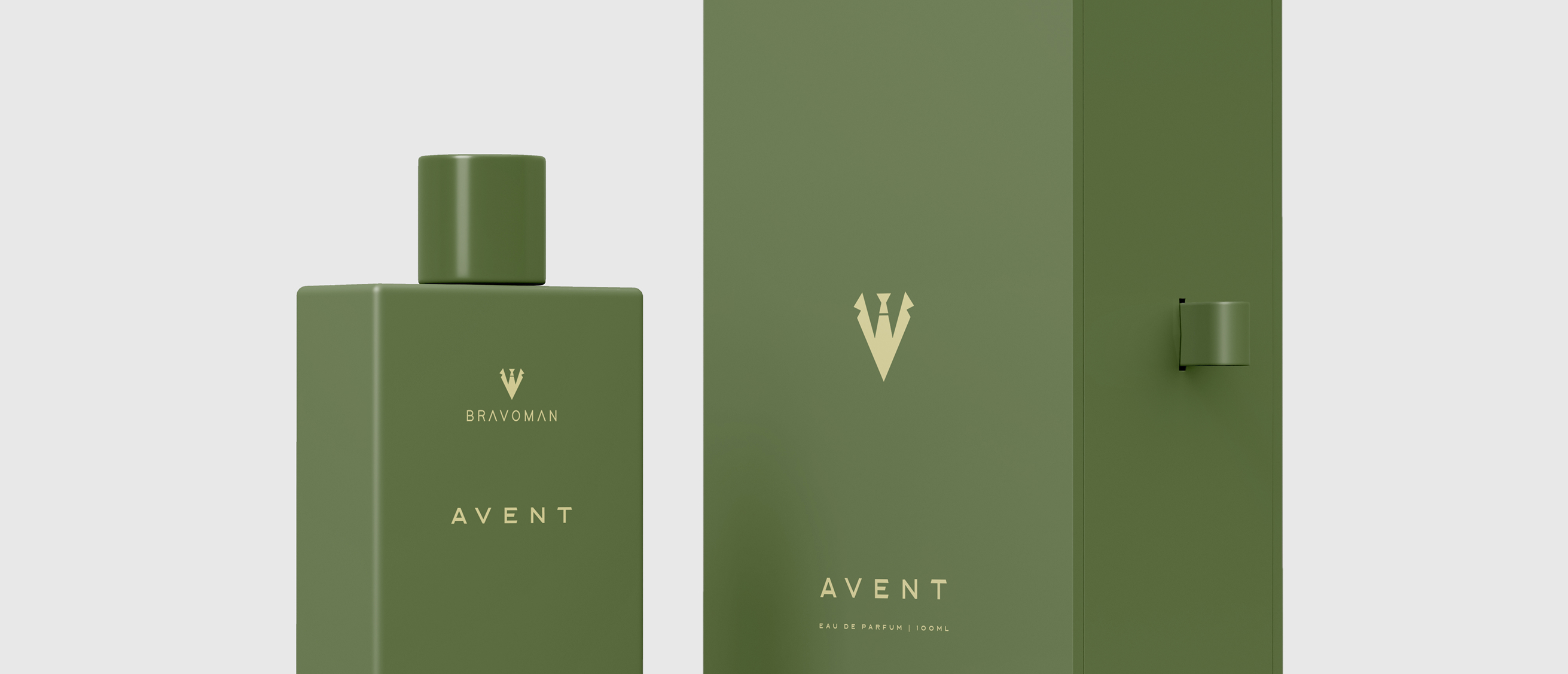
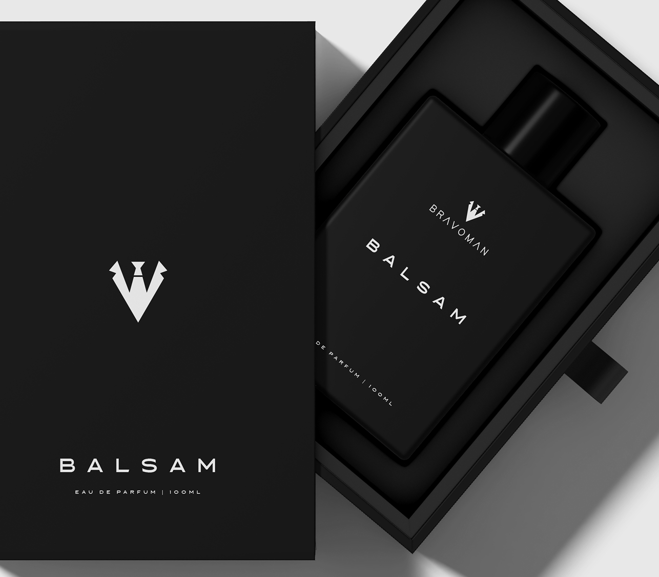
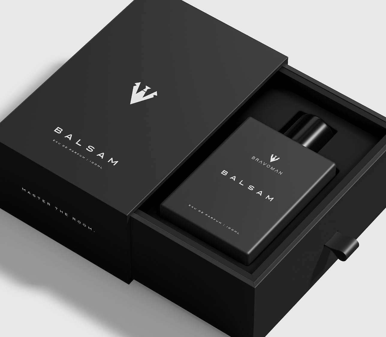
BravoMan’s visual language draws from a deep, sophisticated colour palette that signals luxury and confidence. The primary tones of matte black, charcoal, and platinum silver create a bold foundation, while accents of rich navy and warm bronze add a sense of refinement and exclusivity.
This palette is intentionally designed to be adaptable, lending itself seamlessly to both minimal product packaging and bold promotional campaigns. When paired with high-quality materials such as embossed textures, foil stamping, and a mix of matte and glossy finishes, the identity not only stands out visually but also delivers a tactile experience that reinforces the brand’s premium positioning.
The full logo featuring both wordmark and emblem works as the hero asset for packaging, campaigns, and brand communication, while a simplified monogram version provides a premium symbol for accessories, merchandise, or digital icons. The system maintains clarity and elegance at both large and small scales, whether on billboards, social media, or compact product labels.
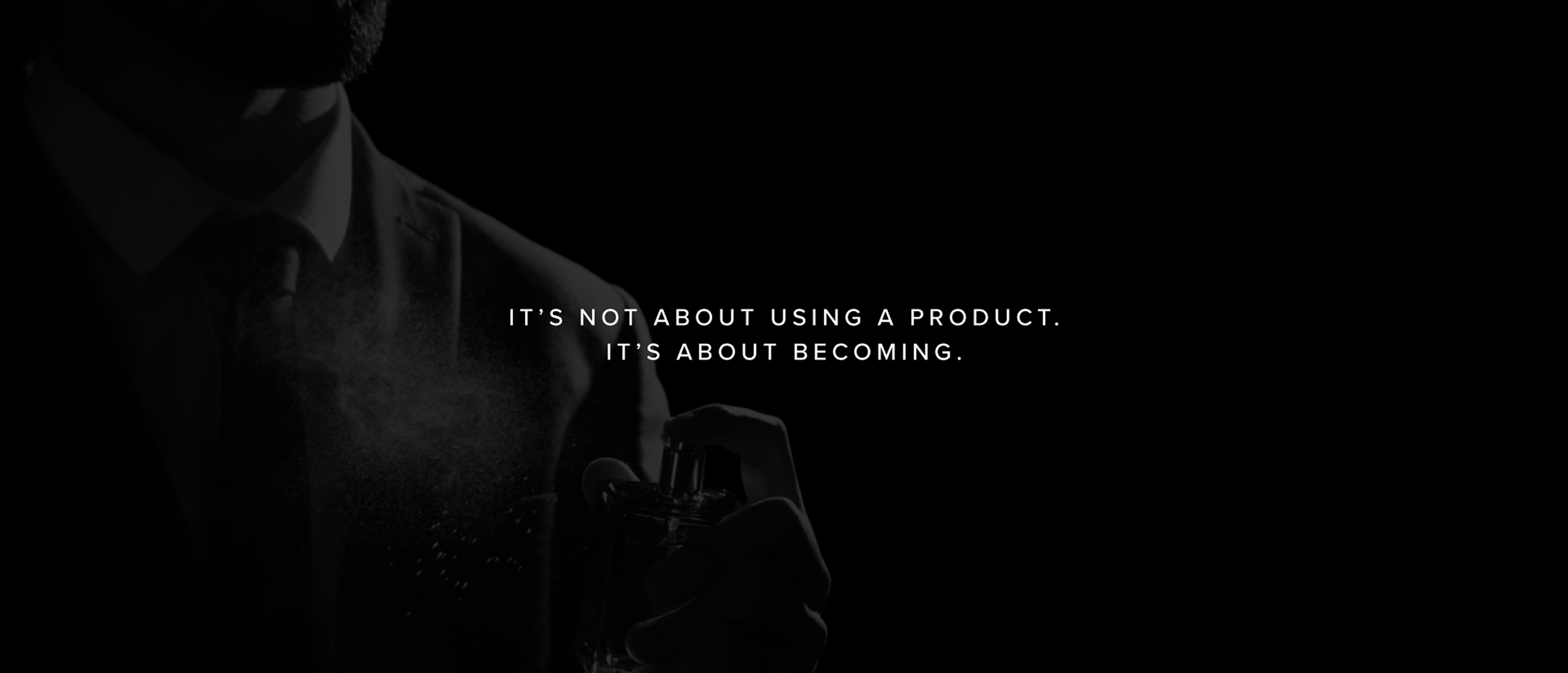
BravoMan’s refined identity is not just about looking premium; it’s about creating an aspirational lifestyle symbol. The design direction establishes BravoMan as a confident, modern, and elegant brand that men aspire to be associated with, standing tall among competitors while carving its own niche in the luxury space.
