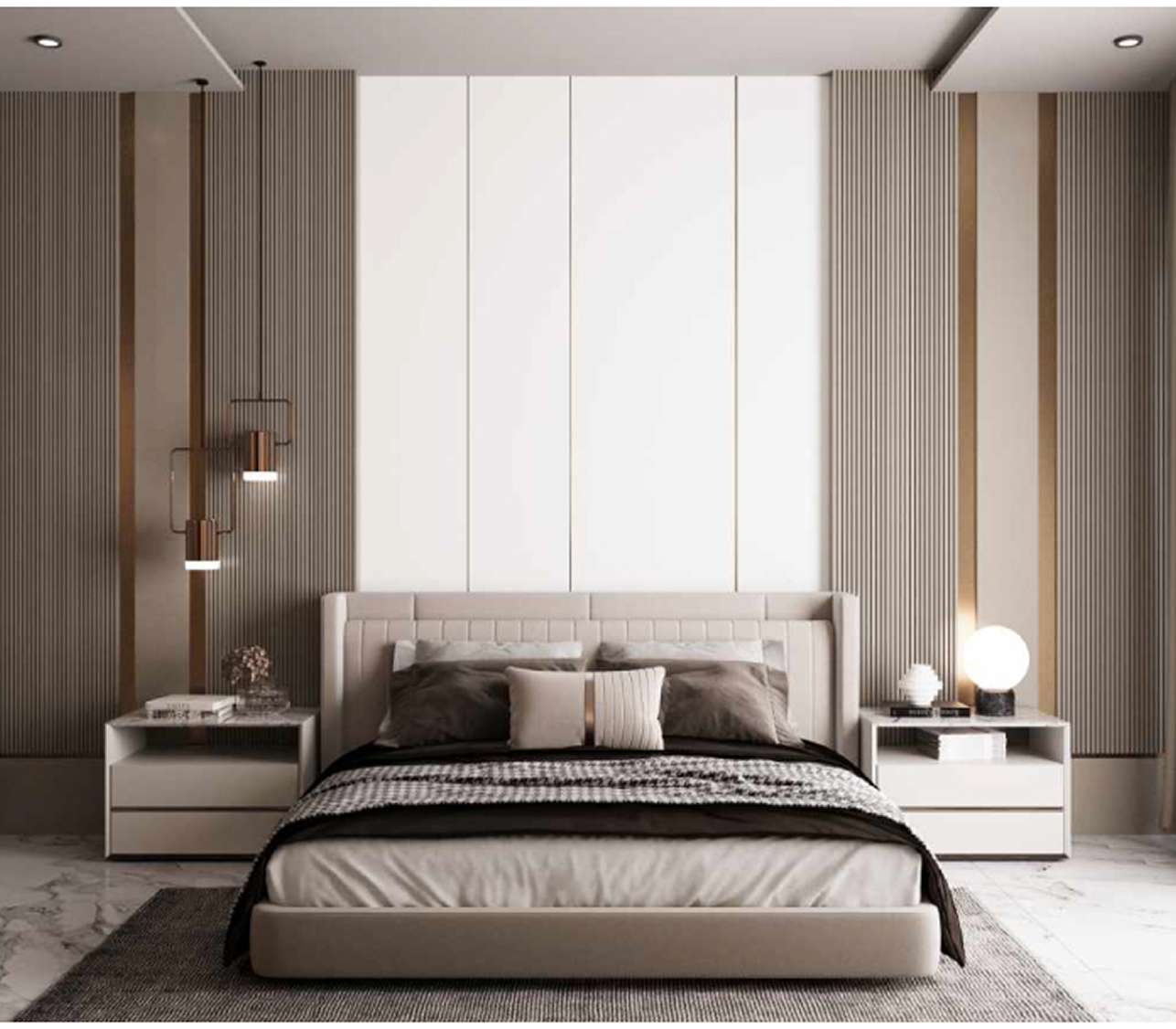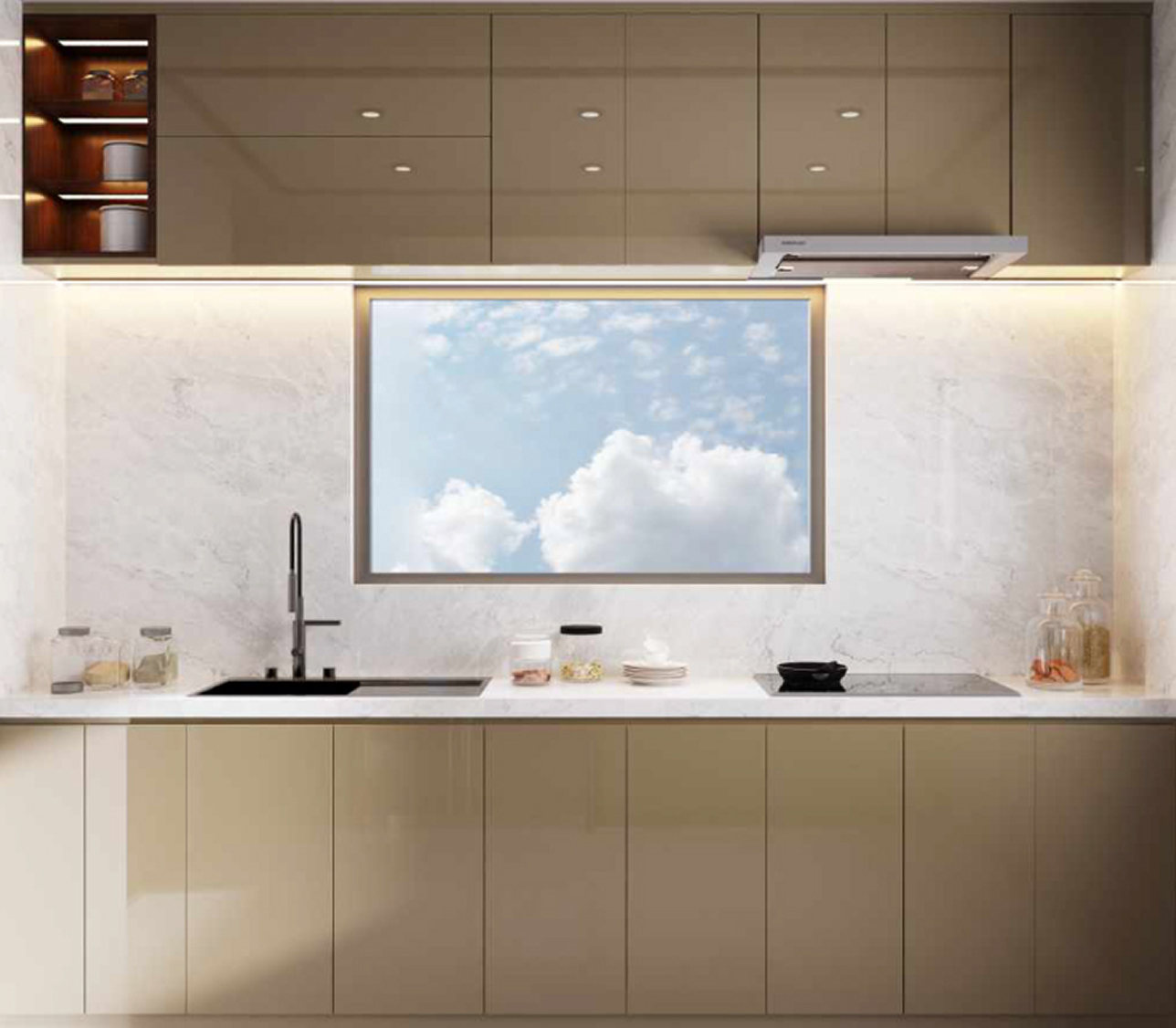
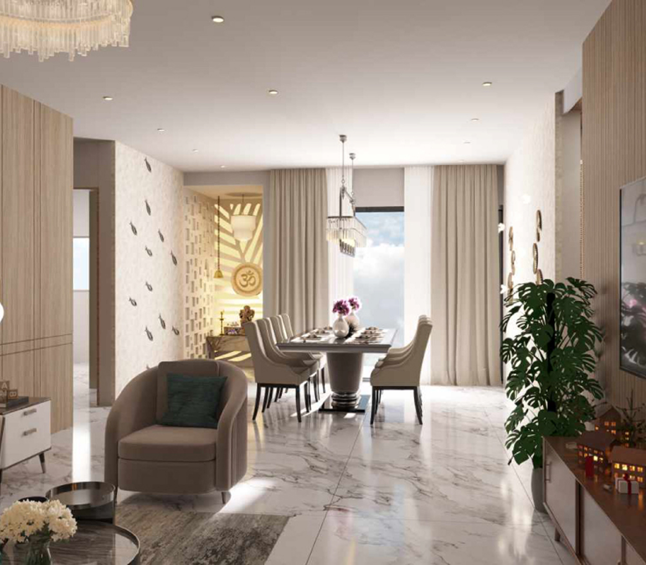
Nilaya’s Elite18 is a one of it’s kind luxury residential project. With 18 floors and only one residence at each floor, Elite18 was envisioned as a living experience that is private, premium, and rare.
The identity needed to reflect luxury without excess. It had to communicate exclusivity, modern sophistication, and architectural precision resonating with the discerning residents who value privacy, elegance, and rarity.
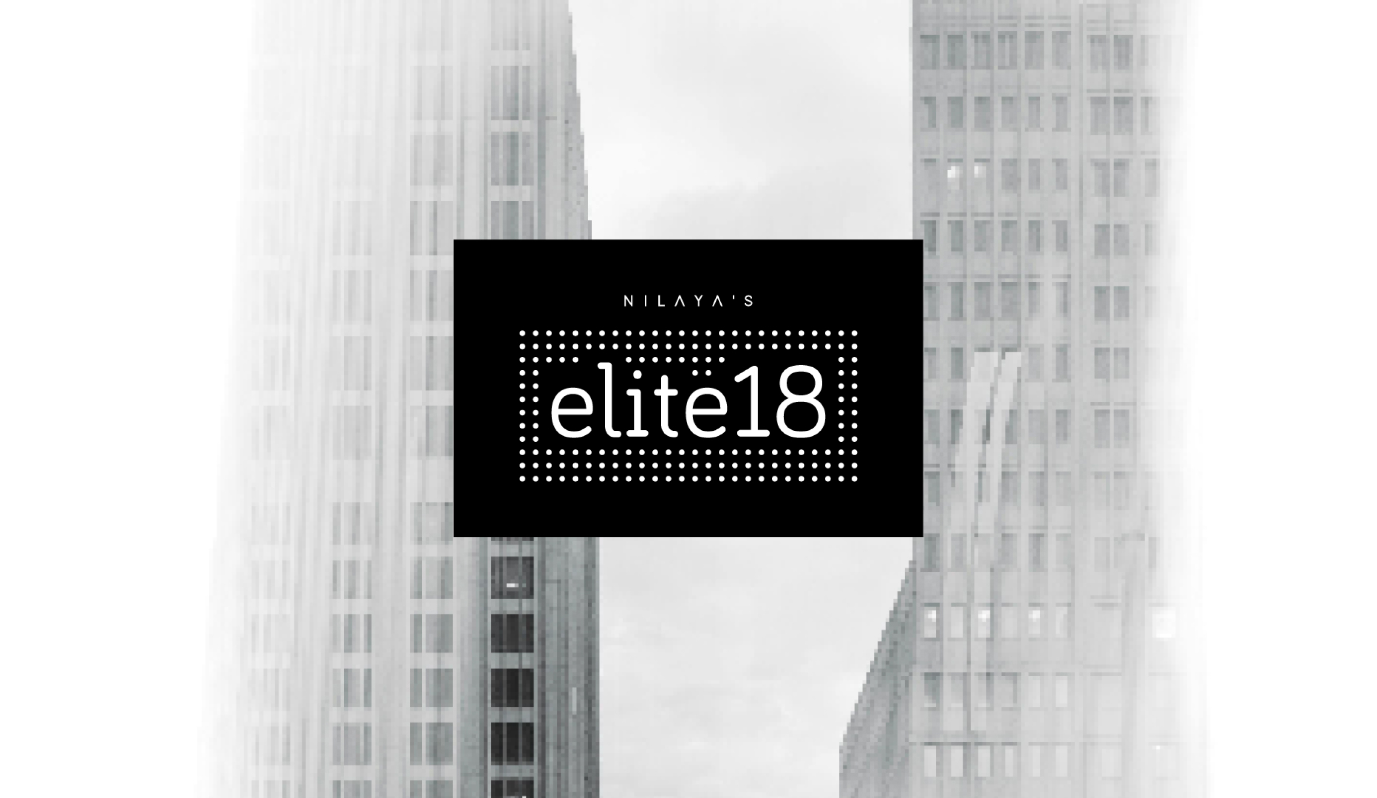
The name itself became the anchor: elite for exclusivity, and 18 for the unique structure of the project. To bring this vision to life, the identity design uses a clean, contemporary typeface, giving the brand a modern and upscale voice.
A grid of dots frames the wordmark, inspired by architectural rhythm and precision. The symmetry and order of the dots echo the meticulous planning of the building’s design, while also creating a visual texture that feels modern and luxurious.

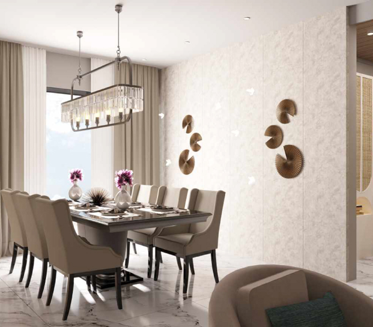
The black and white palette emphasizes timeless luxury and sophistication. The stark contrast lends the identity a bold, striking presence—elevating the sense of exclusivity while remaining refined and minimal.
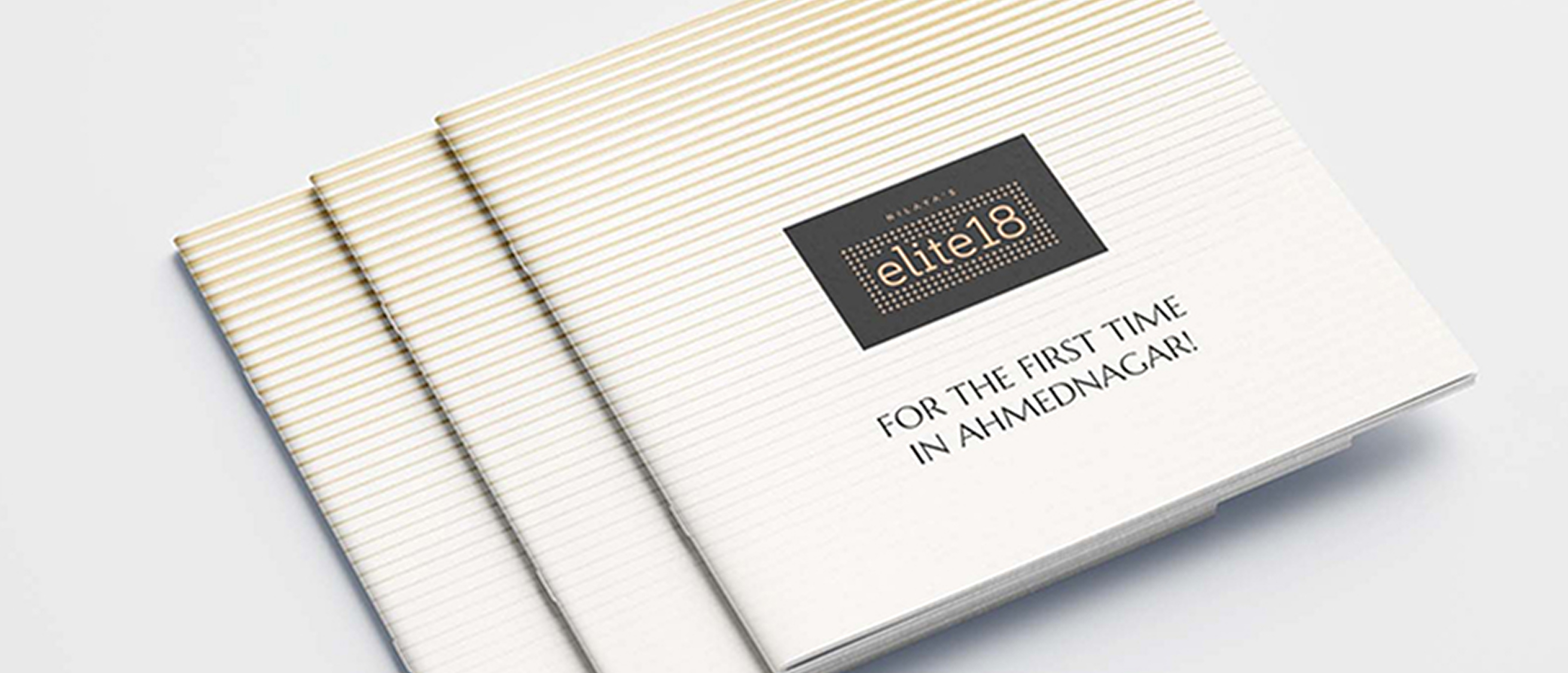
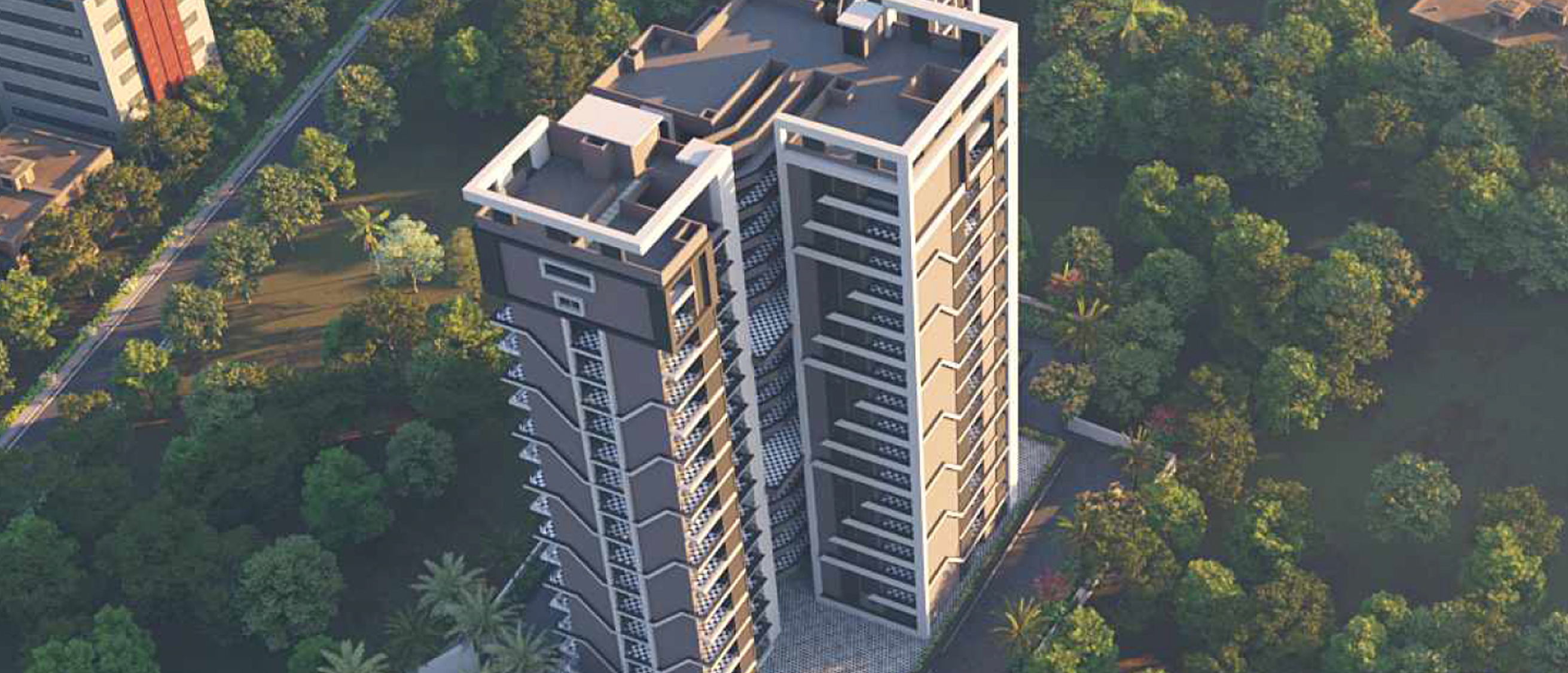
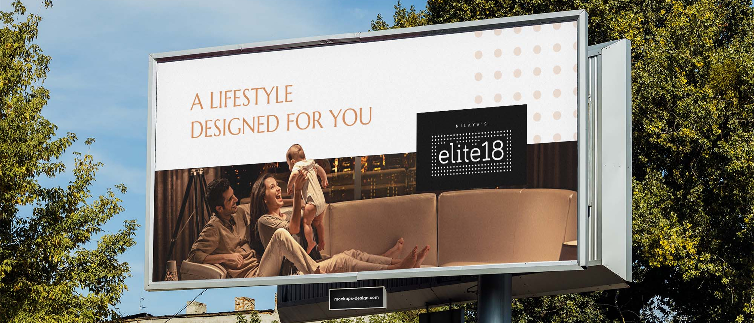
With Elite18, the task was not just to design an identity but to create a visual symbol of rarity. The design celebrates the balance of exclusivity and simplicity, ensuring that the brand identity feels as premium and distinctive as the residences themselves.
